

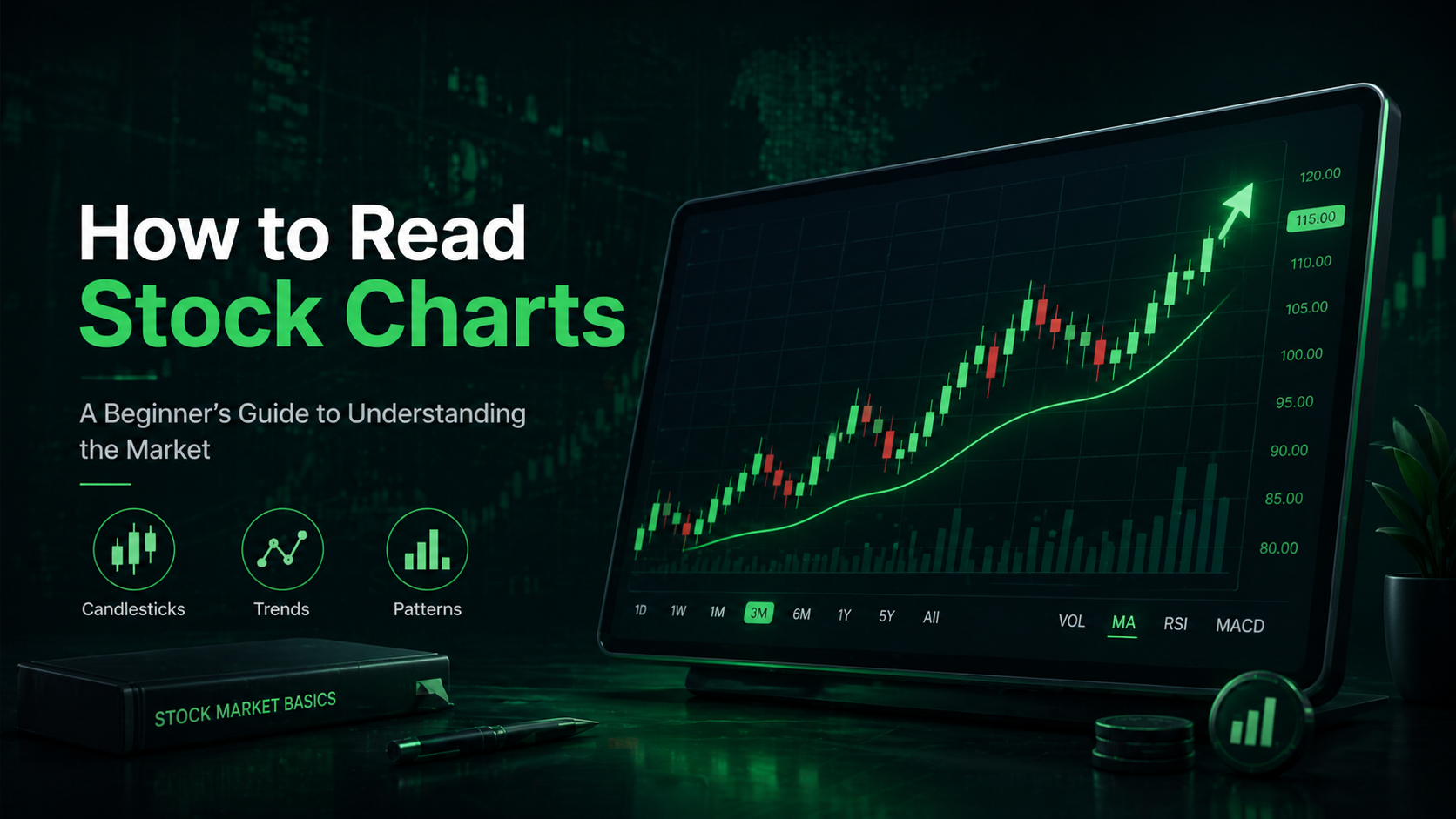
Stock charts can look confusing when you first see them. Lines move up and down, candles change color, numbers update quickly, and traders talk about trends, volume, support, resistance, and breakouts.
But the basic idea is simple.
A stock chart shows how the price of a stock has moved over time. It helps investors understand whether a stock is rising, falling, moving sideways, or reacting to news, earnings, or market conditions.
This beginner-friendly guide explains how to read stock charts step by step, without complicated trading language.
What Is a Stock Chart?
A stock chart is a visual picture of a company’s share price over a selected period of time.
For example, you can look at a stock chart for:
One day
One week
One month
One year
Five years
The full history of the stock
The chart helps you see how the stock price has changed. Instead of only looking at the current price, you can see the bigger picture.
A stock chart can answer simple questions like:
Is the stock going up or down?
Has the price been stable?
Is the stock near a recent high or low?
Did the price move strongly after news or earnings?
Is the stock more volatile than usual?
For beginners, this is one of the most useful tools in the stock market.
Why Stock Charts Matter
Stock charts help investors understand market behavior.
A stock price alone does not tell the full story. For example, if a stock trades at $100 today, that number only gives you the current price. It does not tell you whether the stock was $70 last month or $150 last year.
A chart gives you context.
It shows whether the price has been moving higher, lower, or sideways. It can also show whether many people are buying or selling the stock.
This does not mean charts can predict the future perfectly. They cannot. But they can help you understand what has already happened and how the market is reacting.
The Most Common Types of Stock Charts
There are several types of stock charts, but beginners usually need to know three main ones.
Line Chart
A line chart is the simplest type of stock chart.
It connects closing prices over time with a single line. This makes it easy to see the general direction of a stock.
Line charts are good for beginners because they remove a lot of noise. You can quickly see if a stock is trending up, trending down, or moving sideways.
Bar Chart
A bar chart shows more information than a line chart.
Each bar usually shows:
Opening price
Highest price
Lowest price
Closing price
This gives investors a better idea of how the stock moved during each time period.
Candlestick Chart
A candlestick chart is one of the most popular chart types.
Each candle shows the opening price, closing price, high price, and low price for a specific time period.
Candlestick charts are popular because they are visual and easy to scan once you understand the basics.
How Candlestick Charts Work
A candlestick has two main parts:
The body
The wick
The body shows the difference between the opening price and closing price.
The wick shows the highest and lowest price reached during that period.
If the candle is green or white, it usually means the stock closed higher than it opened.
If the candle is red or black, it usually means the stock closed lower than it opened.
For example, if a stock opens at $50 and closes at $55, the candle is usually green. If it opens at $55 and closes at $50, the candle is usually red.
What a Green Candle Means
A green candle usually shows buying strength.
It means the price closed higher than it opened during that time period. This can suggest that buyers were stronger than sellers.
However, one green candle alone does not mean the stock will continue rising. It is only one piece of information.
A series of green candles can show stronger upward momentum.
What a Red Candle Means
A red candle usually shows selling pressure.
It means the stock closed lower than it opened during that time period. This can suggest that sellers were stronger than buyers.
Again, one red candle does not automatically mean a stock is bad. Even strong companies have red candles regularly.
What matters is the bigger trend.
Understanding Stock Trends
A trend shows the general direction of a stock price.
There are three basic types of trends:
Uptrend
Downtrend
Sideways trend
Uptrend
An uptrend means the stock price is generally moving higher over time.
In a healthy uptrend, the chart often shows higher highs and higher lows.
This means each price peak is higher than the previous one, and each price dip also stays above the previous dip.
Downtrend
A downtrend means the stock price is generally moving lower over time.
The chart often shows lower highs and lower lows.
This means each recovery attempt is weaker than the one before, and each drop moves to a new lower level.
Sideways Trend
A sideways trend means the stock is moving within a range.
The price may rise and fall, but it does not clearly move higher or lower over time.
Sideways markets can happen when investors are waiting for new information, such as earnings, economic data, or company news.
What Is Trading Volume?
Volume shows how many shares were traded during a specific period.
Volume is important because it shows how much activity is behind a price move.
A price move with high volume may be more meaningful than a price move with low volume.
For example:
If a stock rises strongly with high volume, it may suggest strong buyer interest.
If a stock rises with very low volume, the move may be less reliable.
If a stock falls sharply with high volume, it may show strong selling pressure.
Volume does not tell you everything, but it helps confirm whether a price move has strength behind it.
Support and Resistance Explained
Support and resistance are two basic chart concepts.
Support
Support is a price area where a stock often stops falling and starts moving higher again.
It is called support because buyers may step in around that level.
For example, if a stock drops to around $80 several times and then bounces higher, traders may see $80 as support.
Resistance
Resistance is a price area where a stock often stops rising and starts moving lower again.
It is called resistance because sellers may appear around that level.
For example, if a stock rises to around $100 several times but cannot move above it, traders may see $100 as resistance.
Support and resistance are not exact numbers. They are usually price zones.
What Is a Breakout?
A breakout happens when a stock moves above a resistance level or below a support level.
For example, if a stock has struggled to move above $100 for months and then finally rises above $100 with strong volume, this may be called a breakout.
Breakouts can attract attention because they may signal that the market is changing its opinion about the stock.
However, not every breakout continues. Sometimes the price moves above resistance and then quickly falls back. This is often called a false breakout.
What Is a Moving Average?
A moving average smooths out price movement by showing the average price over a selected period.
Common moving averages include:
50-day moving average
100-day moving average
200-day moving average
A moving average helps investors see the general trend more clearly.
If a stock price is above its moving average, it may suggest strength.
If a stock price is below its moving average, it may suggest weakness.
Long-term investors often watch the 200-day moving average because it gives a broader view of the stock’s direction.
Common Beginner Mistakes When Reading Stock Charts
Many beginners make the same mistakes when looking at charts.
Looking Only at Short-Term Moves
A stock can move up or down sharply in one day, but that does not always change the long-term picture.
Beginners should look at multiple time frames, such as one month, six months, one year, and five years.
Ignoring Volume
Price movement without volume can be misleading.
Volume helps show whether a move has strong market participation behind it.
Thinking Charts Predict the Future
Charts are helpful, but they are not magic.
They show historical price behavior. They can help identify patterns, but they cannot guarantee what will happen next.
Forgetting Company Fundamentals
A stock chart shows price movement, but it does not tell you everything about the company.
Investors should also look at company earnings, revenue, debt, business model, competition, and future outlook.
Simple Checklist for Reading a Stock Chart
When you open a stock chart, ask yourself these questions:
Is the stock trending up, down, or sideways?
Is the current price near a recent high or low?
Is the price above or below important moving averages?
Is volume increasing or decreasing?
Are there clear support or resistance areas?
Did recent news or earnings affect the price?
Does the chart match the company’s long-term story?
This checklist can help you avoid emotional decisions.
Example: How to Read a Stock Chart Step by Step
Imagine a stock has moved from $50 to $75 over the past year.
The chart shows higher highs and higher lows. The price is above the 200-day moving average. Volume increased during recent upward moves. The stock recently broke above resistance near $70.
This could suggest that the stock is in an uptrend.
But you should still check the company’s fundamentals. Maybe the stock rose because earnings improved. Maybe it rose because of hype. The chart gives you clues, but research gives you context.
Now imagine another stock fell from $120 to $80.
The chart shows lower highs and lower lows. The price is below the 200-day moving average. Volume increased during the sell-off.
This could suggest a downtrend.
Again, the chart alone does not tell the full story. You would need to understand why the stock is falling.
Are Stock Charts Useful for Long-Term Investors?
Yes, stock charts can be useful for long-term investors too.
Long-term investors do not need to watch charts every minute. But charts can help them understand whether a stock is expensive compared to recent history, whether the market is reacting positively or negatively, and whether the stock is stable or highly volatile.
Charts are especially useful when combined with fundamental analysis.
A long-term investor may use charts to avoid buying during extreme short-term hype or to understand whether a stock has been under pressure for a long time.
Do Beginners Need Technical Analysis?
Beginners do not need to become professional technical analysts.
You do not need to memorize every chart pattern or trading indicator.
Start with the basics:
Price direction
Trend
Volume
Support
Resistance
Moving averages
These simple concepts are enough to understand most stock charts at a beginner level.
Final Thoughts
Learning how to read stock charts is one of the first steps to understanding the stock market.
A stock chart helps you see price history, market trends, investor behavior, and important price levels. It can show whether a stock is moving higher, falling lower, or staying in a range.
But charts should not be used alone.
The best approach is to combine chart reading with company research, financial news, earnings reports, and a clear investment strategy.
For beginners, the goal is not to predict every price movement. The goal is to understand what the market is showing you and make more informed decisions.
FAQ
What is the easiest stock chart for beginners?
A line chart is usually the easiest stock chart for beginners. It shows the general price direction clearly and removes much of the short-term noise.
What does a candlestick show?
A candlestick shows the opening price, closing price, highest price, and lowest price for a selected time period.
What does volume mean in stocks?
Volume shows how many shares were traded during a specific period. Higher volume means more trading activity.
What is support in a stock chart?
Support is a price area where a stock often stops falling and may move higher again.
What is resistance in a stock chart?
Resistance is a price area where a stock often stops rising and may move lower again.
Can stock charts predict the future?
Stock charts cannot predict the future with certainty. They show past price behavior and can help investors understand trends and patterns.
Should beginners use stock charts?
Yes. Beginners can use stock charts to understand price movement, trends, and market behavior. However, charts should be combined with broader research.
Disclaimer
This guide is for educational and informational purposes only. It is not financial advice, investment advice, or a recommendation to buy or sell any stock. Always do your own research or speak with a qualified financial advisor before making investment decisions.